 Log in

| 1 | ||
| 1 | ||
| 1 | ||
| 1 | ||
| 1 |


Do you like strong corporate branding?
Do you like rebellious indie branding?
Do you like truth-seeker branding?
Do you like free-thinking branding?
Do you like hard-science branding?
Do you like goat forum branding?
Do you like other kinds of branding?
Please be as specific as you can.
Please provide examples of good branding.
The more reference examples to work with the better.
Please provide examples of artwork, design, graphics, logos, mascots, motto's, etc. that speak to you.
Please provide examples of WHAT YOU DO NOT WANT. And why?
It's just as important as what you want.
With enough feedback and interest I'll have some direction and can start developing some rough sketches, ideas, etc. that we can mold and refine into a proper brand.
Use the star Trek font.
I have absolutely zero respect for IP. So I would do this.
"Intellectual Property" is the downfall of West, science, arts, media, communications, etc. and patents, copyrights, etc. are only defensible if you have an army of lawyers to fight for your "rights".
I have zero respect for the abomination they've made of Star Trek.
But spite is not a great rebellious reason to use a font.
Fun, but misleading.
This is not a Trek site. Not a sci-fi site. Not a lot of things associated with that.
Further, the goal is to stand out and be original.
We do NOT want to be associated with the corporate social media like Reddit, Facebook, etc. so we should not copy or emulate their branding. Sure there are things we can borrow and learn from, but with the clarity we must not be too much like them in all the ways that matter.
I was just kidding. The Saidit logotype always looked vaguely Star Trek-ish to me.
I guessed.
This dialogue is as much for you and I as it is for the readers.
Agreed. I didn't like it or hate it. It seemed like an amateur default. I really liked the redesign a lot, because I made it to the best of my ability, but I wouldn't have kept it so similar to the first font, as was by request. But it's not about or for me, designed with M7D3's input, to all of our liking. magnora7 picked the original font before I arrived in 2018 (I forgot the name of it, if I ever knew).
Yeah, no shade to you man. You definitely improved it.
This is an open discussion.
All ideas are welcomed. Good, bad, far out.
Brainstorming can take even bad ideas to flip and inspire solutions.
Wow. I forgot about this post. Lost in PostWhenever limbo for a while.
I'm pretty darn sure this was before I knew of SubMatrix.
BOTH need branding. They need not be related in some way. But it's not bad to be either. For example, picture a silhouette of a goat with the word MATRIX across it - and silhouette of a submarine with the same MATRIX across it. It should be obvious that I can do much better than those crude marker sketches I made during a freedom meeting. I've got pages of other doodles, but I haven't even delved into it much with so many directions, fonts, symbols, layouts, priorities, etc. to explore. That's why it would be good to know what is wanted and not wanted. A big list is not a problem - it's a starting point.
I realize that Matrix is going to conjour up images of Keanu Reeves movies, but have were considered an alternative interpretation of the word?
Matrix = Commando?
Besides the movie franchise, there's already other things called "Matrix".
https://en.Wikipedia.org/wiki/Matrix_(protocol) - Matrix (sometimes stylized as [matrix] or [m] for short) is an open standard and communication protocol for real-time communication.
https://Matrix.org/ - An open network for secure, decentralised communication Chat with friends, family, communities and co-workers.
Matrix is quietly becoming the chat layer for governments chasing digital sovereignty
One-to-one and group messaging, encrypted VoIP calls, video conferencing – the open protocol handles them all
https://www.TheRegister.com/2026/02/09/matrix_element_secure_chat/
Schwarzenegger's name in the movie was John Matrix.😉
And of course, there's this: https://en.wikipedia.org/wiki/Matrix_(geology)
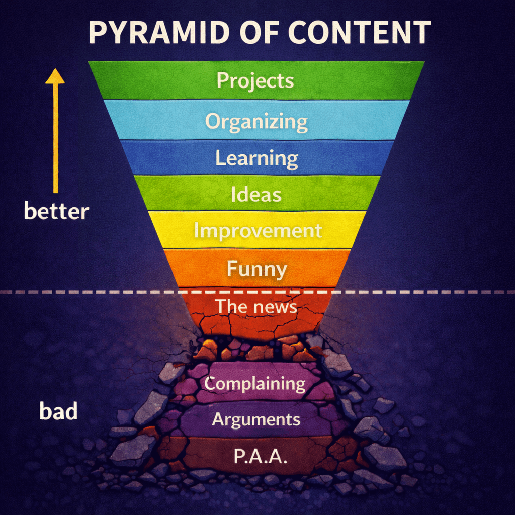
I'll have to think about these a bit. I suppose I like iterative improvement. It prevents a situation where a big overhaul happens and we end up not actually liking it. If you could change just one part of the current branding what would you change?
I feel like this link is manditory https://gvid.tv/v/CQoCVtFGmHM
I vote we change the name from Goat Matrix to Gavin B.
Who?
It's the name of the CEO in the link that xox dropped.
It works best this way, IMO. Even with directors or clients who don't know what they want. Without a deadline or budget we aren't under pressure, so time can be taken, which may be especially useful if clients have no visual imagination or trust - sometimes you just need to get it close to finished before an opinion can be formed.
Here's how I redesigned the SaidIt logo, with a 7x3 ratio completely by happen chance, back when M7D3 and I were all on good terms.
Those happen, but not often. It's part of it. It's more painful for animated scenes to be cut than to rework logos. I'm not afraid of rejection. The ultimate goals are to do the best work possible and make the client happy. Sometimes it can be a tedious process for the client, but I don't recall disappointing.
Usually with a flat rate (in this case $0), I say satisfaction is guaranteed but feedback is needed.
The "logo". It's not even a logo. It's just a blue word on a black background in a bland font - almost embarrassed to be seen. Nothing about it is unique and it doesn't pop with character or charisma, doesn't stand out, isn't memorable, and it says nothing about what Goat/Sub Matrix is about. An actual logo can not be typed out in a common font without some graphic customization.
Besides the logo, I don't see any evidence of a style guide or branding.
That's a funny clip. I feel like I saw the first couple seasons and don't recall why I didn't catch up. Same with Halt And Catch Fire.
So the saidit logo got fatter over time and more legible. So what's at the top isn't a logo. It's a word mark. Most sites have them, usually in a pretty plain font. Take a look at reddit or lemmy. Same with the next top 5 alternatives down. It's pretty much a web standard. So if we can do something slightly more unique we are already surpassing the standard. If anything that wordmark is more stylized than the standard already.
Here is what most other sites have for a wordmark / home button:

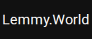

For Reddit that is SVG. For lemmy and scored, it's literal text. So if anything my wordmark is too stylized for the standard.
Also, on Lemmy that's just Lato font which they use for the whole site. It's the most popular reddit alternative so I'm pretty sure a simple wordmark isn't a hinderence to marketing a site.
Stay trendy and remain unnoticed. If you're not unique then you're just more of the same that's been done before. Go wild and remain in the wilderness. Too similar or too weird and you'll get the same sparse results with rare exceptions. Be confident, be what you want to be, be authentic, be different but not too different (unless it's real difference), and stand out, on the fringe, between familiar and novel, by staking out a homestead for your own community.
What makes or will make SubMatrix different than all other sites?
The "Matrix" name is already well used, so there's a disadvantage to that we must overcome. This is not terrible, as there are always pros and cons. You have mad tech talent and skills, proven results, strong vision, solutions-minded, world awareness, and a drive for truth-seeking and freedom of thought. I'd recommend a lighthouse logo in any other circumstance (I'm still thinking of it for our inevitable local newsletter, though I learned of one similar in the UK). Also, for some time I've considered somehow reworking (simpler) or remixing (with what and why?) the laser symbol, like the Laser boat-class symbols distinguish their sails. It's technical, focused, illuminating, and IMO inspiring.
The Lemmy.World and Scored wordmarks do NOT compel me to visit. They lose - and I haven't even been there.
They created a custom font for the Reddit logo. Sure you could use that Reddit font on other projects, but it would inexorably be tied to Reddit. So it's custom, theirs, for their logo and branding. It's clever, with word bubbles. Barely noticeable and extremely subtle when small, but their brand is established and it doesn't demand more.