 Log in

| 1 | ||
| 1 | ||
| 1 | ||
| 1 | ||
| 1 |

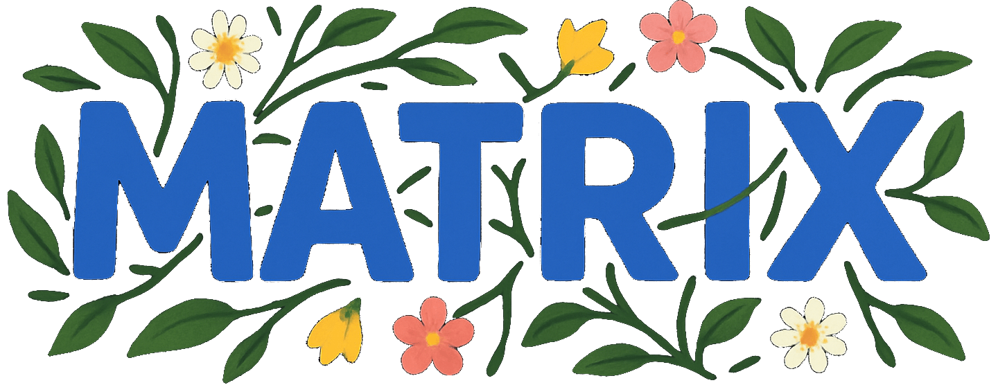
There was an attempt today in improving the logo. I had received some comments that the logo is to minimalist. As I started to work on logos I thought that I should scour the net to see how other sites are balancing having a unique logo without something that isn't too distracting. 98% of the reddit alternatives just use text. Including Reddit itself.
So maybe it's ok to just use text. We could try it in a different font.
But I don't want these cool graphics to go completely to waste. They are just too detailed to fit in the small space I want to fit the logo. None of these sites dedicate a lot of space for that. Hence why they all just use text. Also technically in something like this is called a wordmark. I think the confusion of calling it a logo helps convince people it should look like a logo. But it doesn't need to because it's a wordmark.
TBH this one is growing on me a bit:
I have it in right now for myself. It is way too small. I can do some custom css for it to make it look better.

IDK. Maybe with this position:absolute stuff the overflow outside the panel is kind of cool.
And this is what the bio-cyber wordmark looks like on the front page with a similar treatment.

Cool. But maybe not something to run every day.

Reminds me of what Google and YouTube do on holidays.